Where It All Began
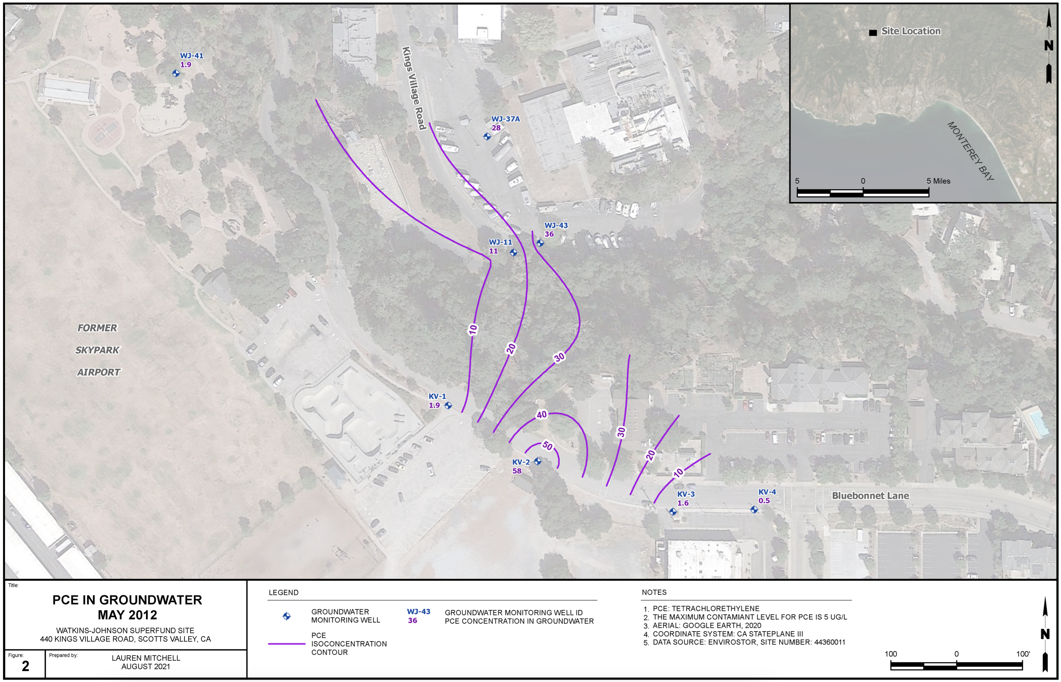
PCE in Groundwater May 2012
My first exposure to data visualization was in my GIS (Geographic Information Systems) minor in college. I then applied that knowledge in the early days of my career as a geologist, conducting fieldwork collecting groundwater samples and then mapping those samples’ chemical concentrations using ArcGIS.
What started as a technical requirement became something more interesting—taking invisible underground contamination and giving it shape and meaning on a map. Each contour line represents contamination levels that affect real communities. This example data was sourced from GeoTracker and was not a client project.
Moving Beyond Technical
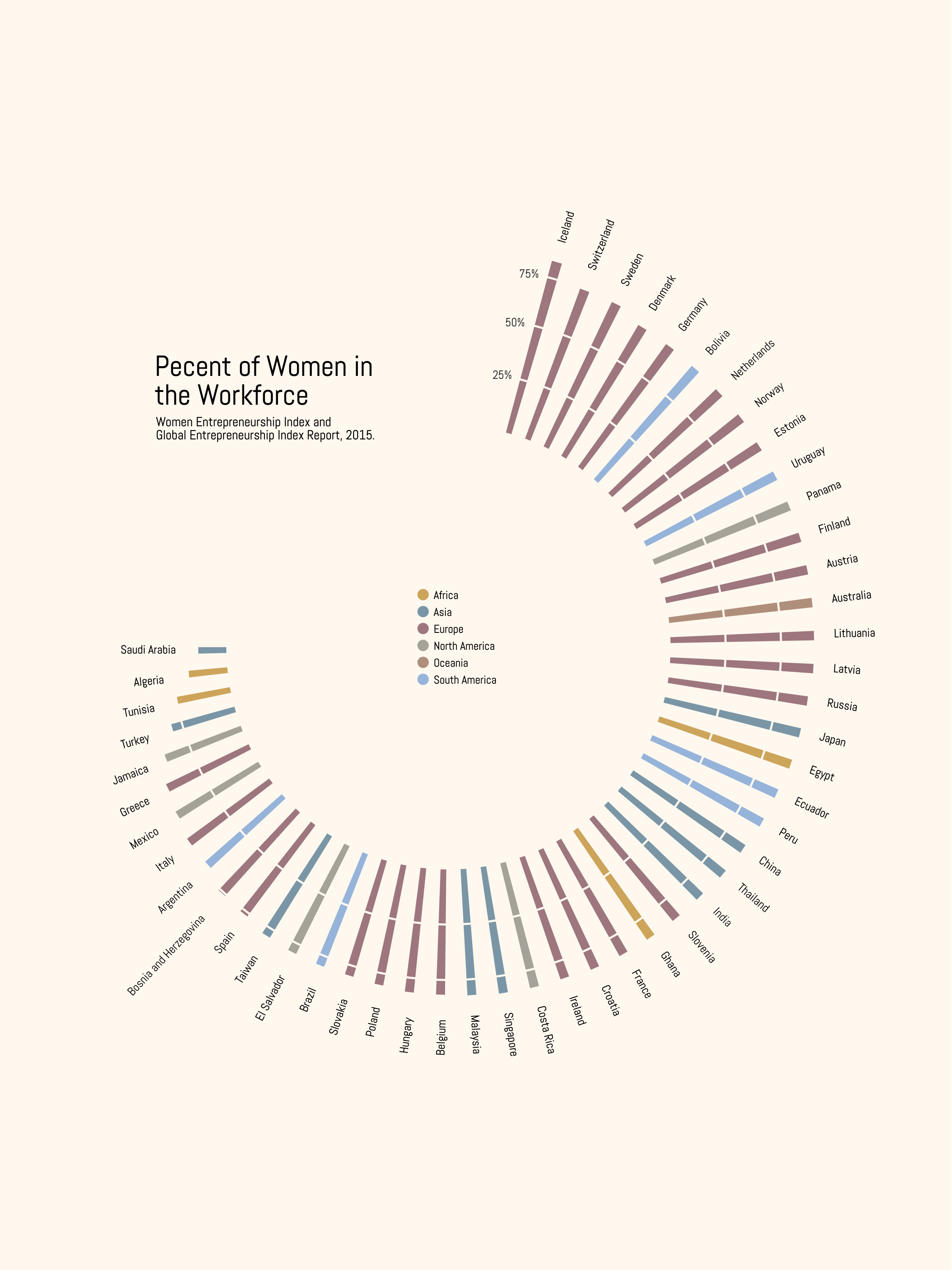
Percentage of Women in the Workforce
This was one of my first explorations into creating more stylized data visualizations designed for print or posters. I sourced the data from the Women Entrepreneurship Index and Global Entrepreneurship Index Report and designed it with the use of Charticulator, a Microsoft tool.
I was curious about pushing beyond purely functional visualizations toward something that could work as designed communication—data that could live on a wall, not just in a report.
Getting Personal
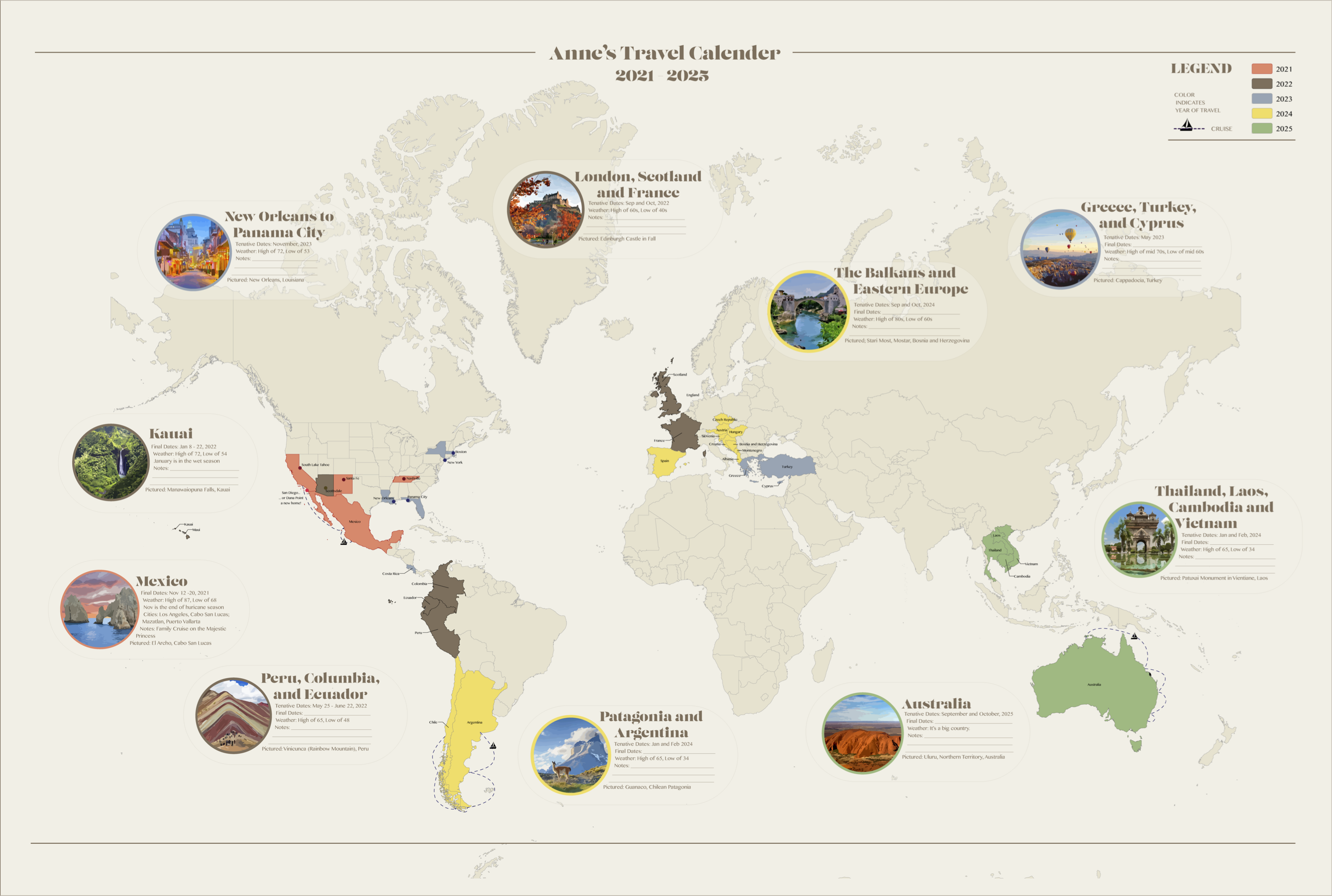
Mom’s Travel Calendar
As a retirement gift for my mom, who plans her travels years ahead, I transformed her itineraries into a poster using ArcGIS and Adobe Illustrator, which I then attached to a corkboard for her office. This personal project is close to my heart, showcasing how data visualization can capture personal histories and futures.
This project taught me that the most meaningful visualizations don’t always involve big datasets or complex algorithms. Sometimes they’re about taking someone’s personal story and giving it the visual treatment it deserves.
Rethinking Format
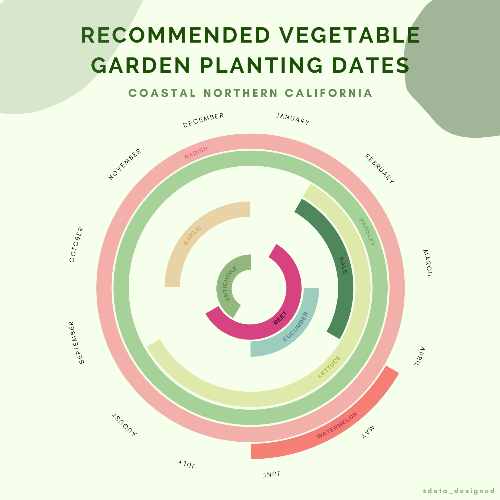
Vegetable Planting Guide
This data visualization answers the question: When is the best time to plant in your Coastal Northern California vegetable garden?
The traditional 12 month calendar was converted into a circle to represent the continuous nature of time and the planting cycle. Sometimes the most effective solution is simply changing the shape of how we present familiar information. The data for this project was acquired online from Table 14.2, pages 351-352 in California Master Gardener Handbook. Nancy Garrison and Dennis R. Pittenger. 2002.
Finding Stories in Simple Data
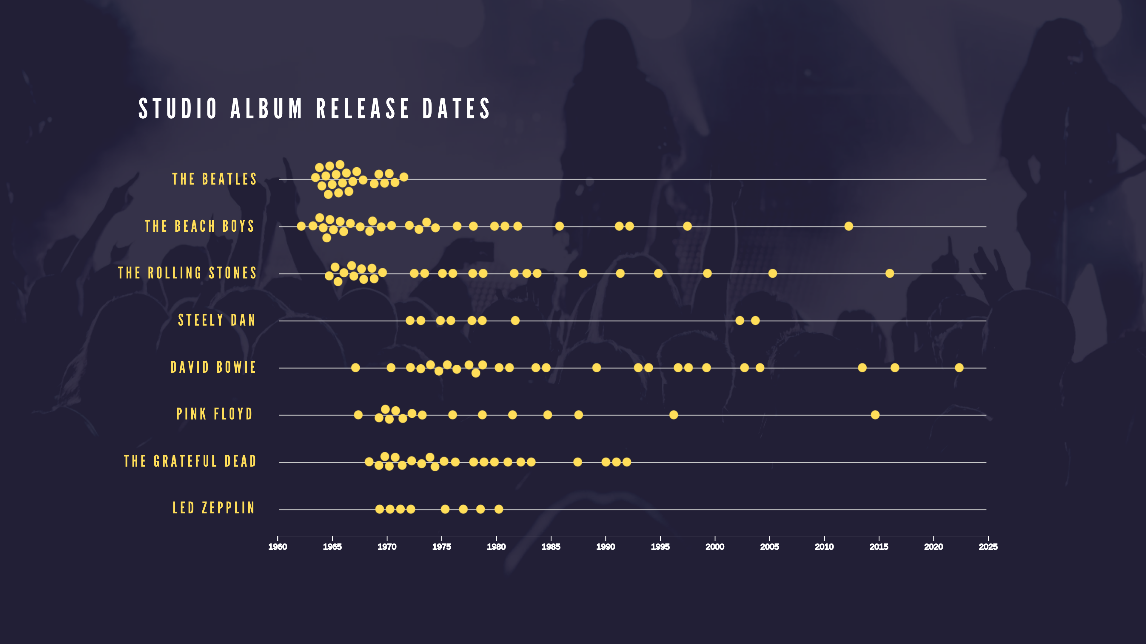
Studio Album Release Dates
This simple visualization of album release dates tells the complex story of these classic rock bands and the impact they’ve had on music history.
It’s a reminder that effective data visualization isn’t always about complexity—sometimes the most compelling stories emerge from the simplest datasets.
Visualizing Change
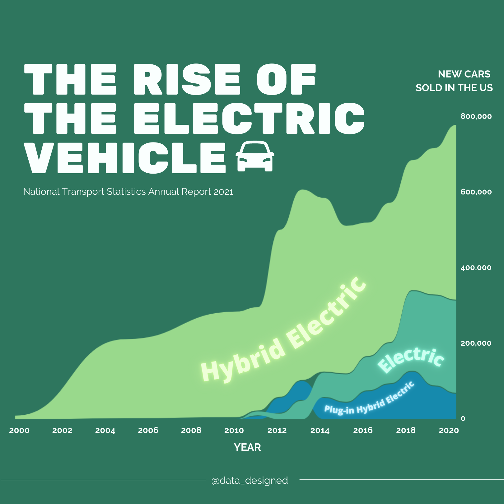
The Rise of the Electric Vehicle in the U.S.
This visualization tells the story of the electric vehicle in the US over approximately the past decade. In 2000 hybrid vehicles were first sold and took off. In 2010 electric and plug-in hybrid electric vehicles were introduced to the market. Hybrid electric vehicles still outnumber electric and plug-in hybrid electric vehicles.
The data for this visualization was sourced from the National Transportation Statistics 2021 Annual Report, which is a publicly available document. What interests me about this dataset is how it captures a major industry transformation in progress—the shift toward more sustainable transportation happening in real time.
What’s Next
Each project here represents a different approach to making data accessible and engaging. From underground contamination mapping to personal travel planning, I’ve learned that every dataset contains a story worth telling. The challenge is finding the right visual approach to make that story clear and compelling.